Soil moisture sensors—How they work. Why some are not research grade
TDR, FDR, capacitance, resistance: A comparison of common soil moisture sensing methods, their pros and cons, and their unique applications.

You’ve buried soil water content and water potential (soil suction) sensors in the ground, installed an ATMOS 41 in the field, and set up your ZL6 data logger. Your network of instruments has been collecting data for weeks or even all season. Now what? Knowing how to extrapolate meaningful inferences from your data, forming big picture conclusions about what is happening, and identifying and troubleshooting issues can sometimes be challenging.
In this article, we will step through multiple data sets to understand how soil water content, soil temperature, soil water potential, and atmospheric measurements can be used to discover the meaning behind the traces. Within this article you will learn how to identify the following events in your data:
Each example will be represented by a graph. It is not necessary to understand every aspect of information within these graphs. Each one is used as an illustration of common soil moisture data patterns you might run into and how to extrapolate the most useful information. Every graph will have a box in the upper right-hand corner with the soil type and crop type so you have a better understanding of the variables at play.
All of the data provided was collected by data loggers, such as our ZL6 series, and uploaded to ZENTRA Cloud. All data sets are either from instrumentation at METER research sites or are supplied by the data owner and are included with their permission.

In Figure 2 we see the data from an engineered loamy sand with a cover crop of turf grass. Our goal when executing our experiments in this example was to improve irrigation in turf grass. This grass had a fairly shallow root zone, the middle of which was about six cm deep and the bottom at about 10 cm. Over time, this example showed first relatively wet conditions to start through June and July, a fixed drying period condition in July and August, and drying until the cessation of water uptake in August and September.
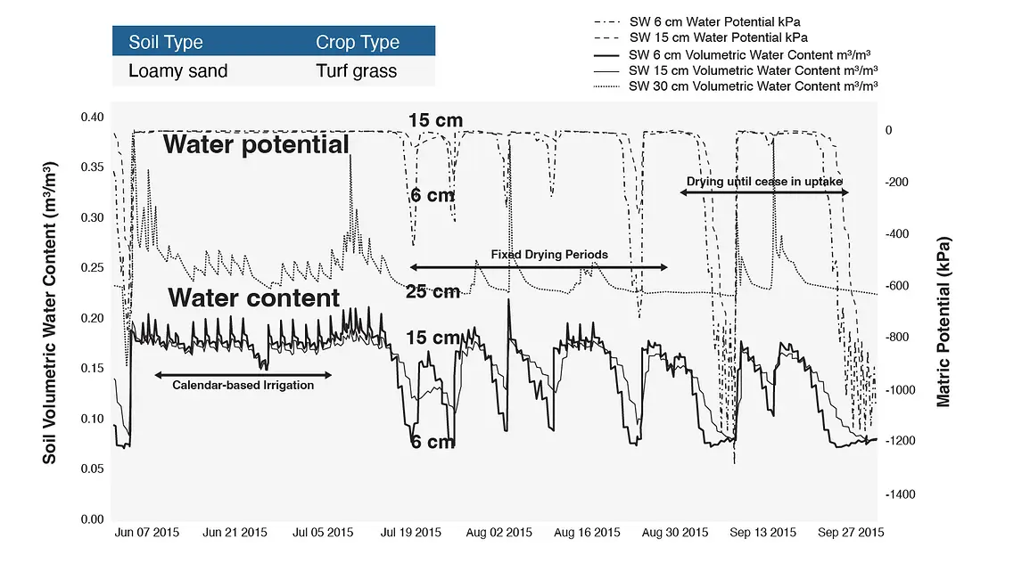
Figure 2 also shows two soil moisture data types: volumetric water content on the left y-axis and matric potential, or water potential, on the right y-axis. Time is on the x-axis ranging from early summer to the start of fall. To understand what these data clusters can tell us, we must look at each data set individually.
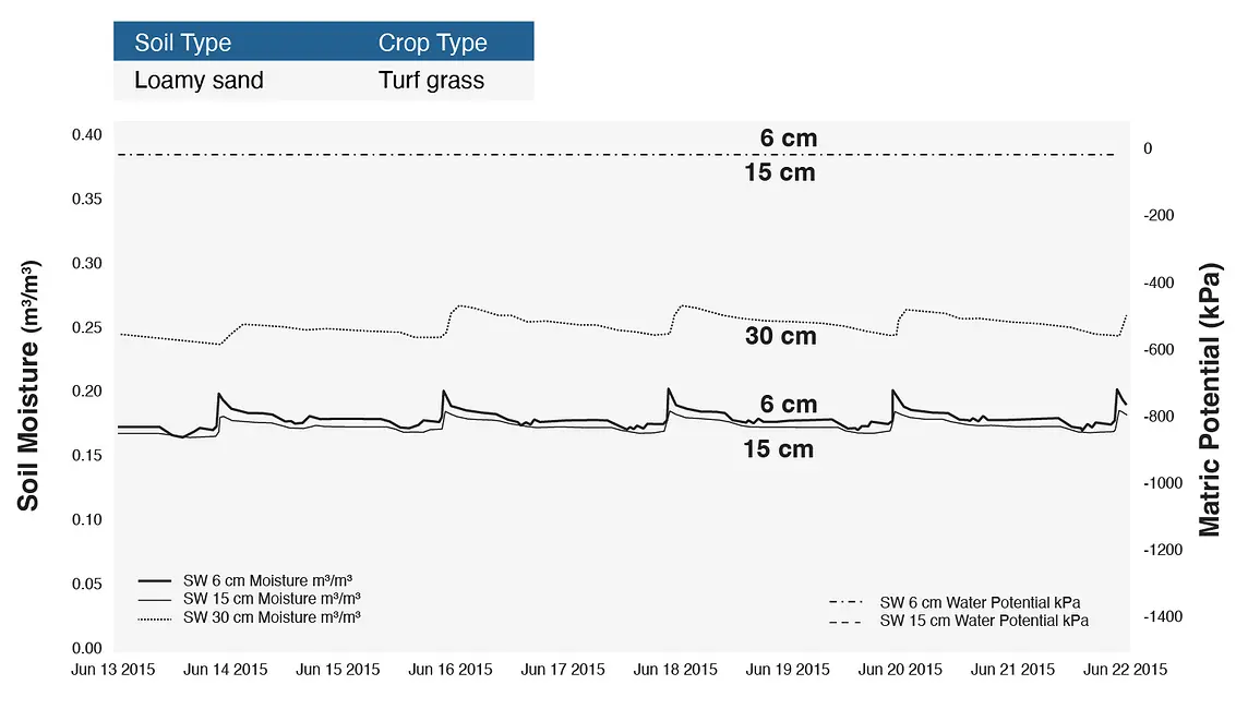
Figure 3 shows both the water content and water potential of the previously mentioned turf grass in wet conditions. This turf grass was in a loamy sand. Notice that the water potential sensors, represented with the dotted lines across the top of the graph, didn’t respond much at all. However, the soil water content sensors show incredible detail, including each irrigation event on the order of days.
The field was irrigated each night with a visible spike when the water hit the sensor, visible in the six cm level sensor. There was also a little spike down at 15 cm, which was the bottom of the root zone. Even at 30 cm, the data showed an increase in water content, but the curve was more rounded off than the 15-cm level sensor. The water potential didn’t show any change at all. The particle sizes were so large that sensors were unable to detect any water being held by those particles. If we look instead at what happened in this loamy sand at optimal conditions, we see some pretty interesting details.

In Figure 5, the six-centimeter soil water content data flattened off during the night and a drop during the day. This was visible day after day and gave us an idea of how much water the plants were taking up at 6 centimeters, the bottom of the root zone. There was a daily drop at 15 centimeters, but it’s not as pronounced because it was at bottom of where the roots were taking up water.
Also in Figure 5, there wasn’t as much water draining down through the profile, which was a really good thing. We did see a little peak on July 14th from the 30-cm level sensor, but no fluctuation during the subsequent irrigation event. This loamy sand is very responsive to the water that was being applied. The water potential data showed a small response at the six-cm level. This did not indicate any stress as it was only dropping down into the -200 to -400 kPa range, which was still above the stress range for this turf grass.
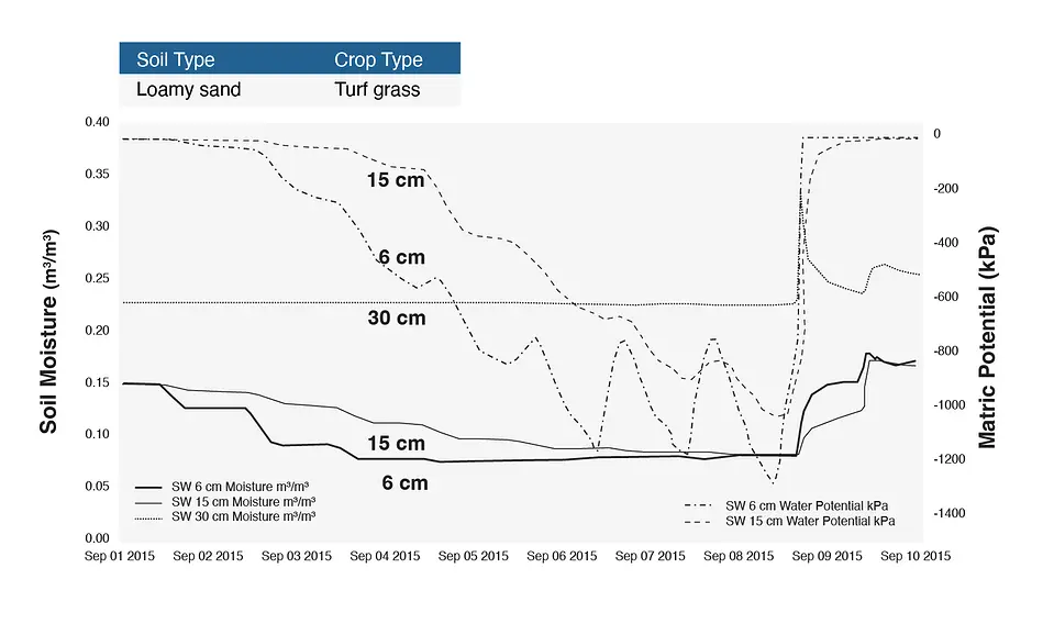
In drought conditions (Figure 7), gradual optimal water uptake was also visible at the six-cm level. The issue in this data set was seen at the 15-cm level sensor where water levels were just as high as the 6-cm level sensor, indicating water was leaching down through the soil without getting absorbed. A daily uptake was visible until suddenly stopping around September 5th. At that point the grass is no longer able to uptake water from the soil, changing from actively growing into dormancy.
The water potential shows a really interesting curve in this soil moisture data set, dropping down negative to -1500 kPa, or permanent wilting point. This grass was in dormancy because the water wasn’t available for the grass to take up. Both the water content and the water potential measurements showed a clear picture of decline in these drought conditions. Unfortunately in this case, the farmers didn’t respond to the signs in the data until the soil got very dry.
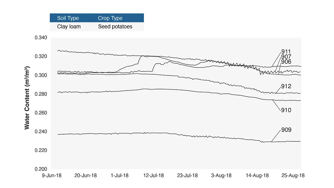
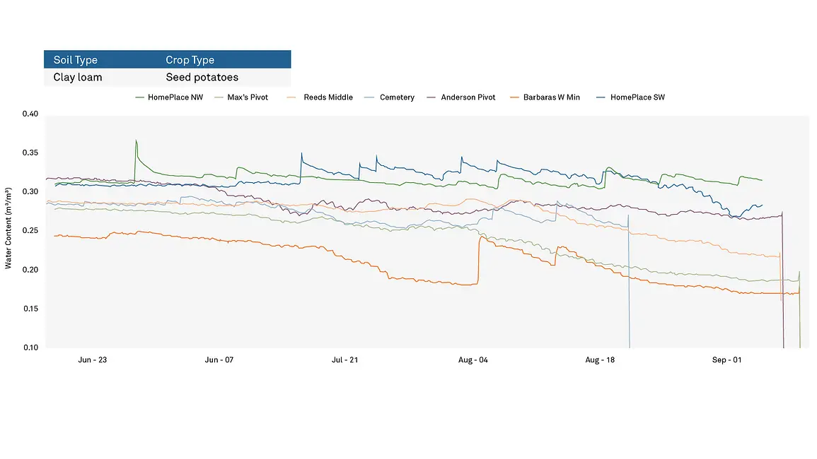
What happens when the soil is not a loamy sand, but now a fine-textured soil: a clay loam? Figure 8 illustrates a clay loam that was growing seed potatoes in southern Idaho which was almost 700 m in diameter in which we installed sensors at six locations. This graph represents very little change to water content throughout the entire season, only fluctuating about 2 to 3%. The grower looked at these data and wondered how he could determine when he should be turning off the water to this field. Using just this data, it is very hard to make that determination, as we explained in our previous webinar Water Resource Capture: Turning Water Into Biomass. While water content data is very helpful in determining the presence and amount of water, it does very little to tell us if the plants are stressed or to help us understand when they’ve had enough water.
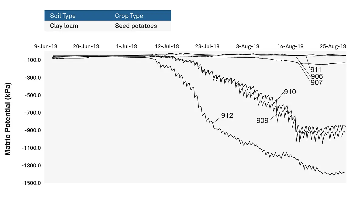
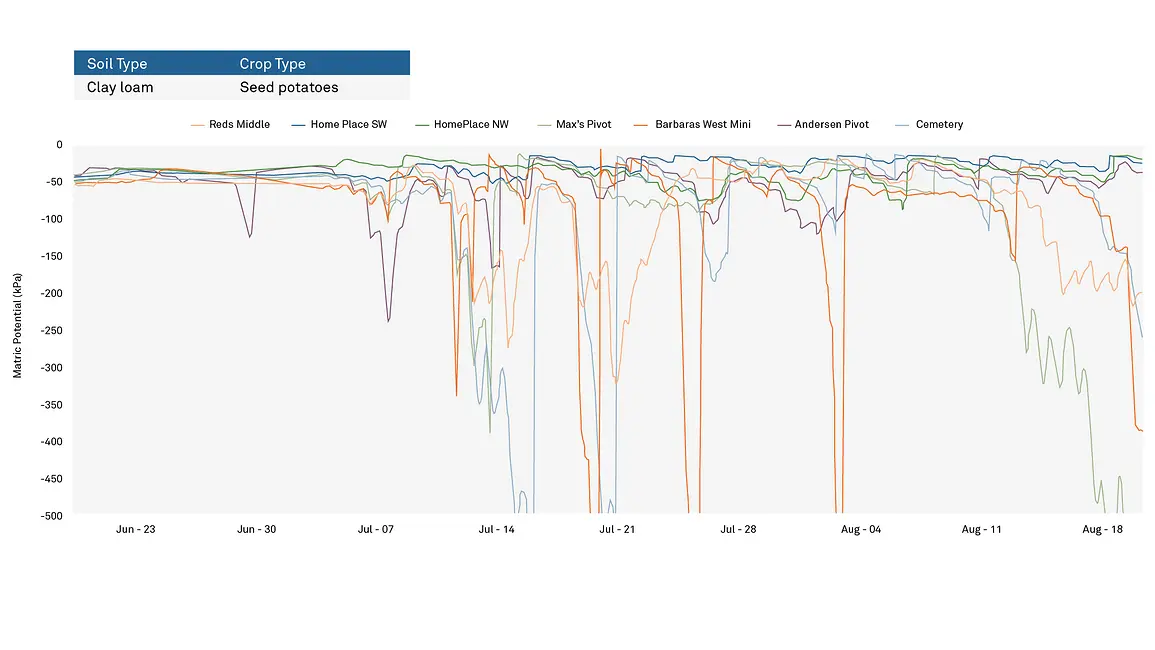
To understand the stress levels of the plants and their ability to update water, we must examine the matric potential (also called water potential) (Figure 9). While the soil water content data painted a picture of consistent, non-remarkable watering throughout the season, three of the six sites had matric potential levels dropping into the stressed range with one dropping down very close to the permanent wilting point. The leaf temperature of the plants in these areas, as measured by an instrument such as the IRT infrared thermometer, was recorded at much higher temperatures than the air temperature. And the yield in these locations was much lower than the yield from areas not measured to be in stress, providing validity to the matric potential measurements and their indication of a problem.
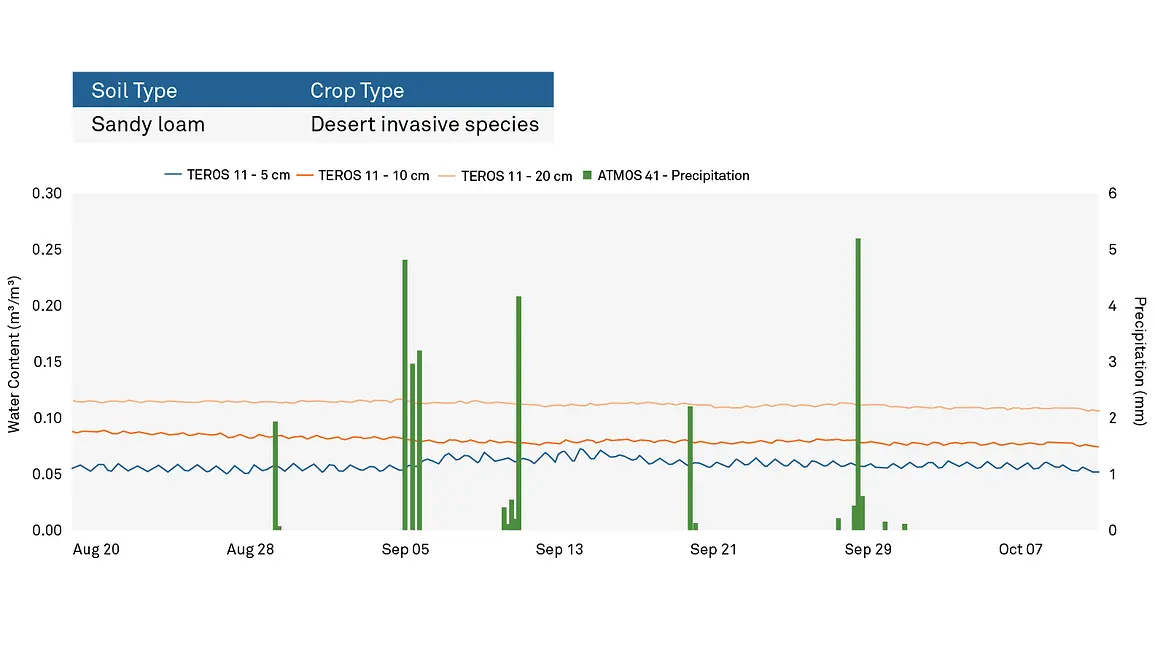
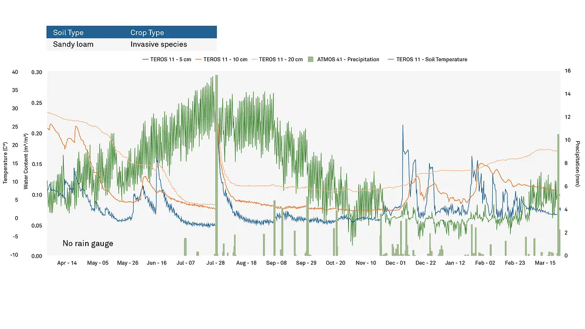
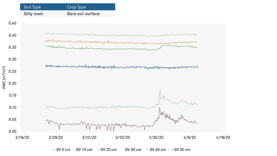
The sandy loam soil in Figure 10 is found in a desert in Rush Valley. In this example, we were not examining a crop, per say, but rather invasive species within a native system. The reason for this instrumentation installation was to understand why invasive species such as cheatgrass were out-competing the native vegetation in the area. The green lines represent precipitation events, and the horizontal lines represent the three water content sensors placed at different depths.
Looking at Figure 10, you will notice that even the four- to five-mm wetting events made little to no impact on the five cm level sensor and zero noticeable impact to the sensors at 10 and 20 cm. Why did the precipitation event not appear in the water content data? There are a few contributing factors. This measurement period was preceded by a very long, hot, and dry summer when the temperature of the soil went above 40°C almost every day, making the soil hydrophobic. In addition, the soil was powdery dry, causing all of the water to be absorbed and held at the surface before evaporating again, leaving no chance for water to move deeper into the system.
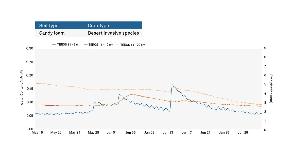
Figure 12 shows soil moisture data in the same desert sandy loam soil earlier in that year. While precipitation data was not included on this chart, wetting events did occur in correlation with each of the spikes visible in the five-cm depth water content sensor. Note that in the five-cm level sensor, a wetting event happened around May 28th but is not reflected in either the 10- or 20-cm level sensors. The wetting around June 2nd showed evidence of moving the needle at the 10-cm depth, but does not reach the 20-cm mark. Even more surprisingly, the largest wetting event occurred around June 14th and did not show at all at 10 cm, but it creates a small spike at the 20-cm depth. What does analysis of these soil moisture data tell us?
Like in Figure 10, the top layer of soil absorbed a lot of the moisture from the first wetting event and fed the high evaporative demand without allowing the soil an opportunity to drain downwards. As the water table filled during the second wetting, some water made it down to the 10-cm depth sensor, but stopped short of the 20-cm mark. The bigger conundrum was the last wetting event. Why did the five-and 20-cm sensors register an increase in water content without any increase showing at 10 cm?
It is easy to think of rain events creating a uniform distribution of water across the soil surface, infiltrating evenly, but that isn’t always the case. Instead of going through the soil as one giant block, the water travels through the soil in branching fingers, not always touching every soil particle. What most likely happened in this case was that one of those fingers of water circumnavigated around the 10-cm depth sensor and continued to travel down to the 20-cm level sensor. This is the most likely explanation for this data anomaly, but it would still be important to monitor the area to make sure there isn’t any issue with the infiltration in that area.
Let’s explore a few use cases where weather monitoring can make the difference in understanding what is happening within the soil. A few years ago we experienced a flood event in Pullman, WA, the location of METER headquarters. A very small stream called the Missouri Flat Creek which runs parallel to the main road in town, flooded the street and multiple businesses, creating a large swath of destruction through the heart of the community. How did this happen? Can the data help us understand the warning signs of impending flooding?
(See the Weather Monitoring Master Class for more info on monitoring weather)
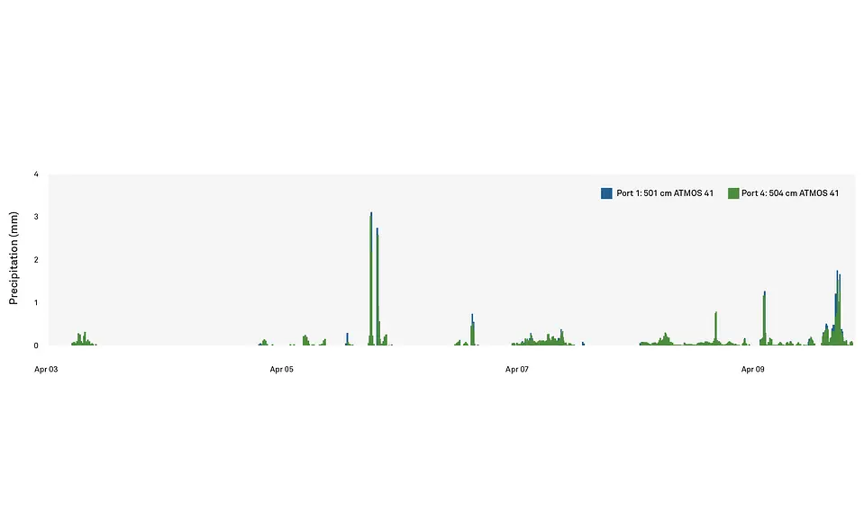
The precipitation data in Figure 13 doesn’t explain why the flooding occurred. The largest precipitation events only reached about 3 mm. Multiple sensors showed the same volume of precipitation, which doesn’t seem to suggest the potential for flooding on the scale that occurred within that tiny creek. To gain a better understanding of what occurred, we need to turn to soil water content measurements in the area (Figure 14).
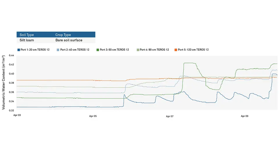
The soil water content levels were holding very consistently until the wetting event started sometime on April 6th, causing a rise at the 20-cm level, then 40 cm, a little at 60 cm and 90 cm and even some showing all the way down at 120 cm. Towards the end of April 7th, the water started to drain out of the upper levels of the soil and filter down into the lower regions. Subsequent rain events meant that by the 9th, the 60 cm level was reading rather full water content levels and began to flatten out, as did the rest of the depths, which was a sign that the water table was filling to capacity, signaling an impending flooding event. At the end of April 9th, more rain tipped the scales, and the Missouri Flat Creek overran its banks.
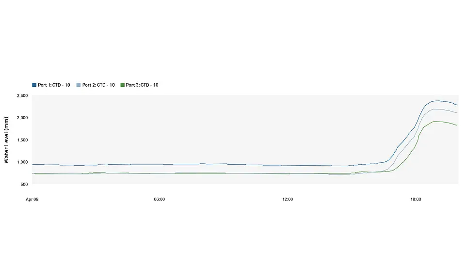
Figure 15 shows water depths along the side of the creek, which illustrates that the water level was maintained at 1 m. The final rain event correlated with the water content plateau as the water surpassed its banks and reached almost 2.5 m.
In a ships clay (Figure 16), a high shrink-swell clay located in south Texas, we inserted several water content sensors to illustrate what an analysis of soil moisture data would look like in the event of soil cracking.
If we compare sensor behavior, we see an interesting pattern. One sensor at the 20-cm depth showed a gradual decline after each wetting event, but the other sensor at the same depth showed a steep drop, which would typically be expected in a sandy soil. This begs the question–what was occurring in this clay to cause these readings? The phenomenon you’re witnessing in this data set is that the sensor with the steeper curve was embedded in a section of the clay with a high shrink, which was causing the soil to shrink back from around the sensor, producing air gaps, causing the electromagnetic sensor to not read as high as expected. Figure 16 is a perfect example that shows this precipitous drop was indicative of soil cracking.
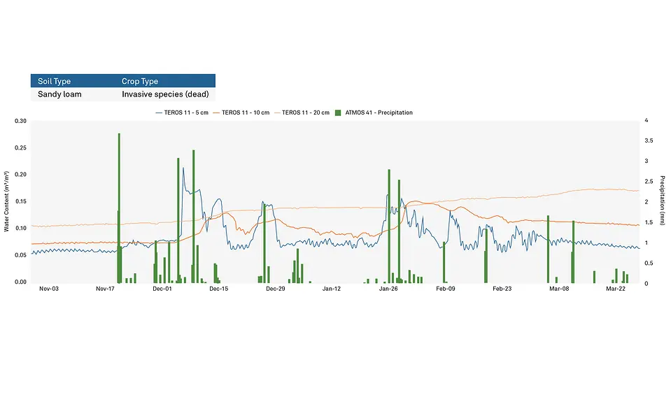
Figure 17 shows a sandy loam field which contains invasive species that were dead due to the temperatures. As each rain event happened, notice that the water content measurements jumped up and then had jagged stair-steps down. Did these sensors become unburied? What can explain the fluctuations illustrated in this data? If we add the temperature measurements to the graph, it becomes clear what was occurring.
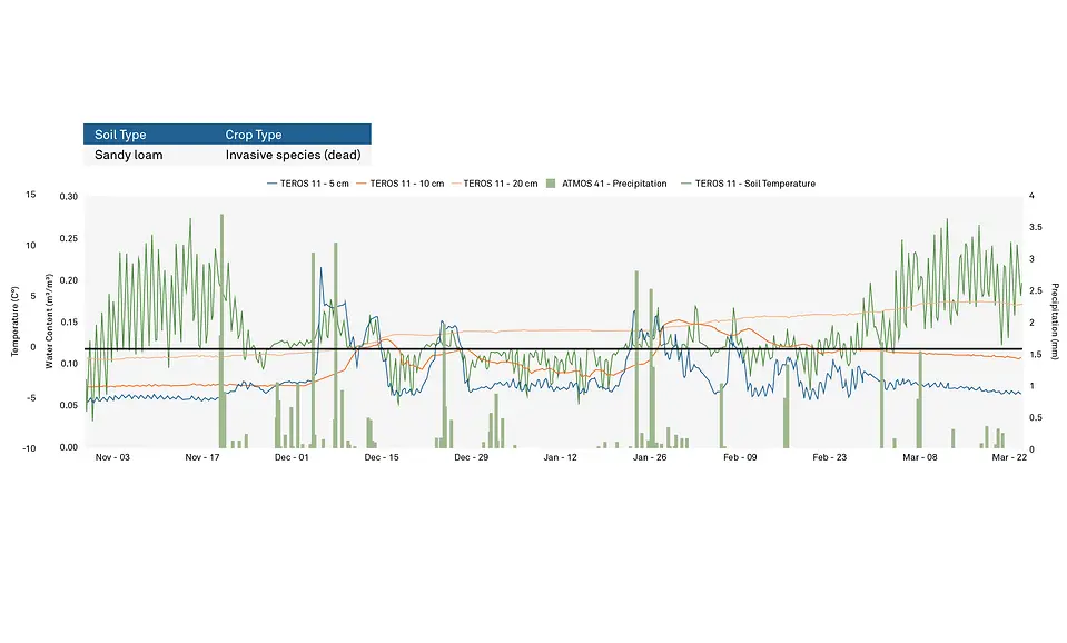
The bold black horizontal line in Figure 18 indicates 0°C, or freezing. With temperature measurements and a freezing point added, it became clear that when conditions froze, the water content readings dropped down and seemed to fluctuate. When the temperatures rose above freezing, water content measurements rose back up into a range we would expect. This relationship makes sense. The more water freezes, the more the water molecules disappear to the electrical magnetic field that the sensors are using to detect the presence of water. Not all of the water was frozen, so the amount of water measured did not drop to zero, but it does significantly drop. Once thaw occured, the data showed the soil water content levels smoothing out and returning back to where they had been prior to the freeze. This is the pattern that should be expected in freezing situations. Figure 19 is a view of the same data set in the context of an entire year. Notice how the freezing events looked distinctly different than the smoother ebb and flow of the summer data. The dotted line in the winter months is the pattern you should expect in the water content data without the freezing event occurring.
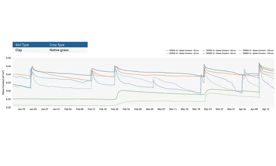
In Figure 20, we placed sensors in seven areas, all within three to four km of each other, in a clay loam soil with seed potatoes. The sensors in Figure 20 were installed after a wet winter with a lot of snow followed by rain.
Depending on your experience level reading water content data, you might wonder why there is so much variability between these seven sensors, even towards the beginning of the data set. This variance is a function of soil type. Even if the type of soil is categorized similarly, each spot will have its own baseline, so it’s important to compare soil water content measurements to previous measurements in the same spot and not expect identical readings from one location to the next, no matter how close they are. However, if we examine the water potential data for the same fields across the same time period (Figure 21), we can see that the water potential for these sensors all started out within +/- 10kPa of each other, which was remarkably close. That is the power of using water potential measurements across a field regardless of soil type.
In the summertime, it is important to account for a certain amount of water content fluctuation, especially in readings close to the soil surface. In that way, all water content sensors can act as temperature sensors, too.
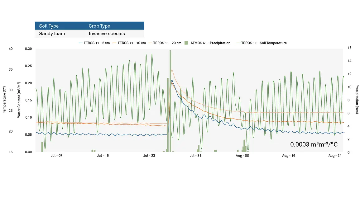
In Figure 22, the data showed a daily temperature swing of +/- 14°C. Without the knowledge of those temperature changes, the jagged nature of the water content measurements might be wrongly interpreted as hydrological movement of the water, when really it’s illustrating the effect of heat change on the soil moisture content. Each small blip of water content change was really only 0.0003 m3 m-3 /°C.
We’ve shown a few examples up to this point that might have initially looked like signs of water uptake by vegetation, but was explained away once the data was examined further. So what does hydraulic redistribution look like in your data? Let’s explore four graphs in succession to see if we can prove the presence of water uptake from the soil into the plants. Each graph highlights data across the same time period in the same irrigated wheat field within 500 m of each other.
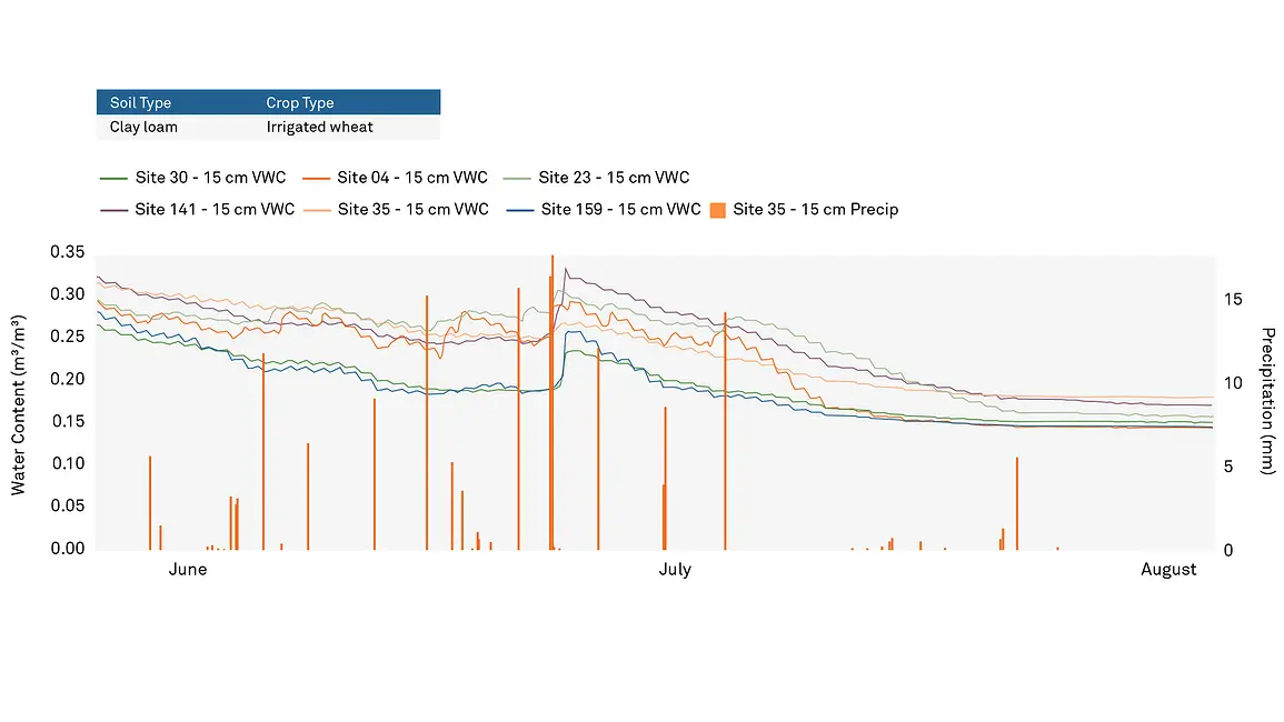
Figure 23 shows the water content at a 15-cm depth across the field. Irrigation was running on and off through the end of July, with a few precipitation events occurring after the irrigation shut-off point. Each water content sensor was showing a classic diurnal pattern, which might look at first glance to be temperature fluctuations, but at that point in the season, the field had a full wheat leaf canopy with a Leaf Area Index (LAI) of about four to five with very little radiation making it down to the soil surface. This makes it unlikely that the diurnal flux could be attributed to temperature change. The pattern only stopped when irrigation had been turned off and the plants had taken up as much as they were able.
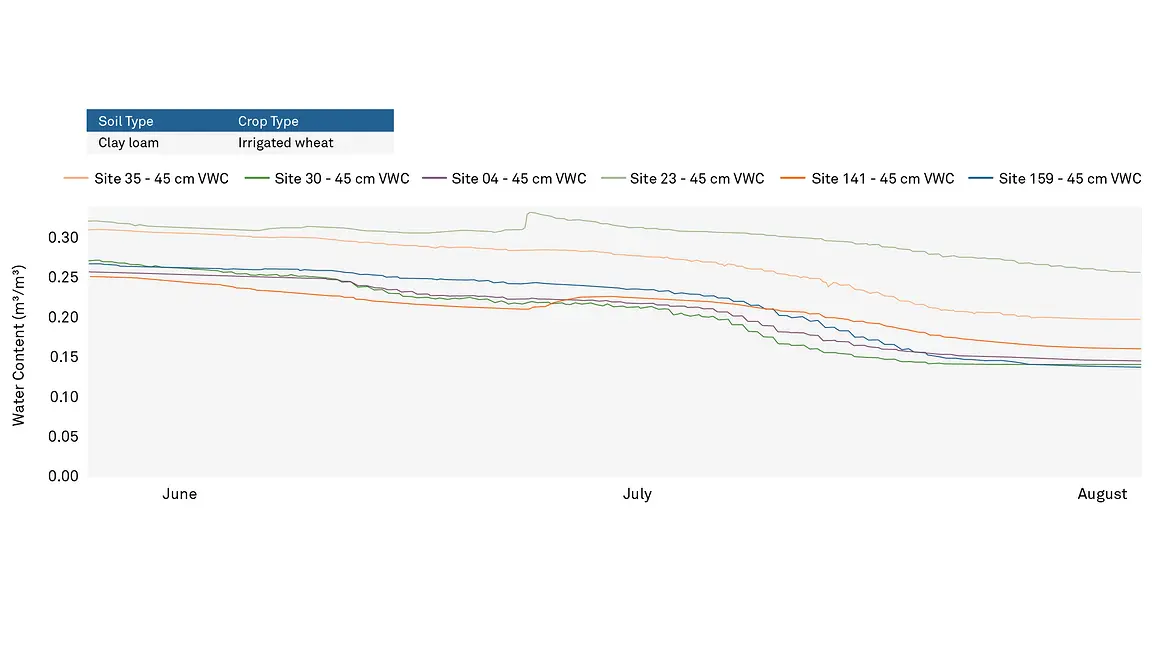
At the 45 cm depths in Figure 24, the diurnal pattern wasn’t present at the beginning of June, only becoming prominent at the end of June. Around the time the water was turned off in late July, the diurnal pattern was the most pronounced, dropping during the day and plateauing at night. Being that deep into the soil, this data was much more in line with water uptake by the plants as opposed to temperature change.
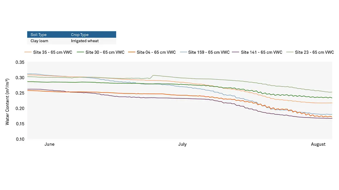
As we move deeper into the soil (Figure 25), the same diurnal stair-stepping was not visible until mid to late July and was seen well into August.
While accuracy and reliability are two of the most important factors to us when it comes to all of the instrumentation we manufacture, there are other factors, such as installation and maintenance that can cause any sensor to fail.
Figure 26 is a great example of what a failed sensor looks like within the data. Several sensors had charted a very steady course and had been smoothly streaming data when suddenly only one sensor dropped almost instantaneously and began providing a large array of variable data. Luckily for this user, their sensor was connected to the ZENTRA Cloud, which automatically alerted them to the sensor failure so it could be addressed in a timely manner with minimal disruption to continuous measurement. In this case, their sensor had become unplugged, and once it was plugged back into the data logger, the sensor continued to operate perfectly.
The last data anomaly we will discuss in this article is faulty data due to problems during the installation process.
Like all scientific endeavors, it is important to know what information you expect to encounter before analyzing readings. For a silt loam soil such as the one shown in Figure 27, the soil was fairly wet, and we would expect those readings to be at or above 30% volumetric water content. Instead, we were seeing two sensors that were reading at 10% and below. This is a great example of a time when it would be worthwhile to examine the sensors and potentially reinstall them.
Each situation and data set will be different. Ensuring that you come away with the correct deductions and inferences from the data is crucial for the validity of your conclusions. With that in mind, let’s recap a few things to keep in mind while interpreting your unique data.
Our scientists have decades of experience helping researchers and growers measure the soil-plant-atmosphere continuum.
TDR, FDR, capacitance, resistance: A comparison of common soil moisture sensing methods, their pros and cons, and their unique applications.
Among the thousands of peer-reviewed publications using METER soil sensors, no type emerges as the favorite. Thus sensor choice should be based on your needs and application. Use these considerations to help identify the perfect sensor for your research.
Most people look at soil moisture only in terms of one variable—water content. But two types of variables are required to describe the state of water in the soil.
Receive the latest content on a regular basis.